
visual identity
The overall identity system uses contemporary, bold design elements with a distinctive color scheme that avoids typical fitness industry clichés like dumbbells or muscular imagery. Instead, it focuses on creating a fresh, vibrant brand identity that emphasizes movement and enjoyment in fitness.

About

Ignacia is a personal trainer who specializes in HIIT (High-Intensity Interval Training), working with clients at all levels from beginners to intermediates. In addition to high-intensity training, she also offers mobility training, including stretching, yoga, and strength training.
Concept

The visual identify project seeks to escape common gym'related signs, such as dumbblls and muscles. For the identify project, I chose to highlight Ignacia I, creating an illusion of strenght and elevation like an arrow, resulting in a logo that represented head'to'body movements. Two logos were made for the project, the firt as a main design option, the second being a secondary option to represent her love for physical armies.
Font & Color

The colors used were chosen to deviate from the usual green and blue, and convey femininity and strength at the same time. The font chosen was to do the opposite, in terms of usualness, as it conveys a sense of stability and concentration.
The Instagram


Instagram posts are intended to emphasize women. Through exercises, whether outdoors or not. But with the necessary support from a professional, the result can be more than effective, because exercises have a right way to be performed, and with the right professional, the result will be effective.
The card

The card was designed to convey the sensation of running and constant movement.
The clothing
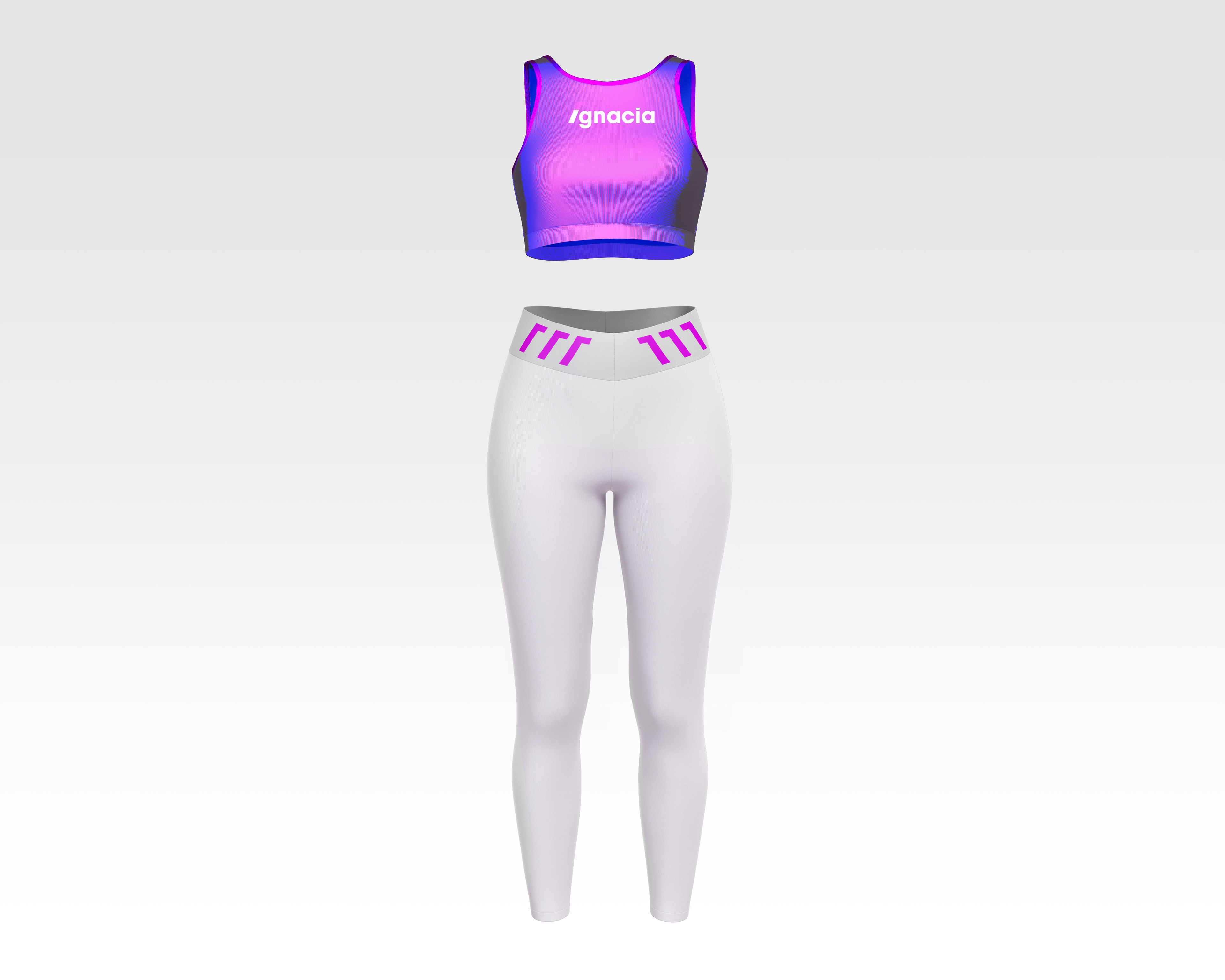
The piece was created to simultaneously advertise the brand and enhance the parts of women who feel most insecure. With the logo facing in opposite directions, it conveys a sense of celebrate and also a visual aesthetic.
Find the fun in fitness.